Getting Started 4
In this tutorial you will be introduced to tabbed windows. You will move everything created in the previous tutorials into one tab and add new Line Chart Visualization to another tab. The Line Chart Visualization will be configured to show selected order data over time, allowing the user to view trends. You will then style the tab User Interface to match the style of the rest of the dashboard. Finally, you will add a context menu to allow a user to jump from Tree Grid Visualization to the Line Chart Visualization.
Tutorial Objectives
In this tutorial you will:
- Make use of multiple Tabs.
- Create and configure a Line Chart Visualization.
- Style the Line Chart to match the whole application.
- Be introduced to styling a User Interface component (Tabbed Panes) for a whole application.
- Create a simple context menu item.
- Show a tab using AMI Script.
Videos
End Product
The video below showcases the result of this tutorial.
Follow Along
Using Tabs
The three visualizations (accounts Table, orders Tree Grid and order details Table) you have created in previous tutorials allow a user to explore textual account and order data. One way to further enhance the presentation of the data would be a graphical representation however there is little space left in which to put one. One option would be to create an entirely new window but then the user needs to manage multiple windows that show related content. A better approach is to make use of AMI tabs which allow multiple visualizations to be contained in one single window. This way related visualizations are grouped in a single window. You will create the Line Chart visualization later in this tutorial, first you will move all of your existing work into a tab.
Enter EDITOR mode.
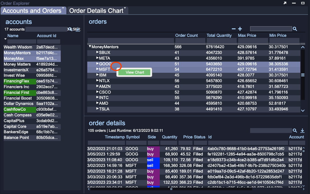
Click on the green Gear of the Div1 divider that separates the accounts visualization from the order and order details visualizations (see the Move To Tab image below).
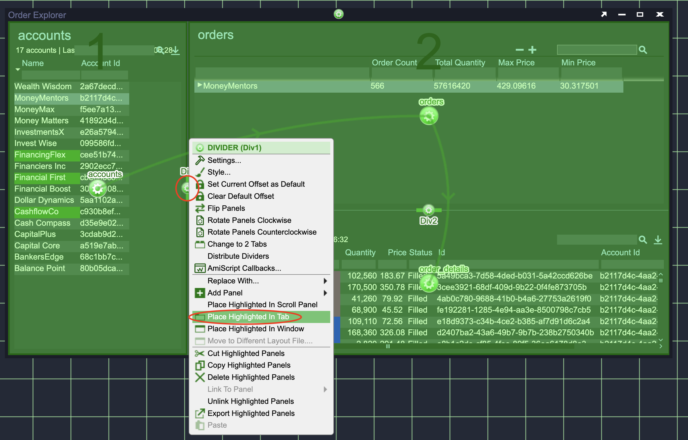
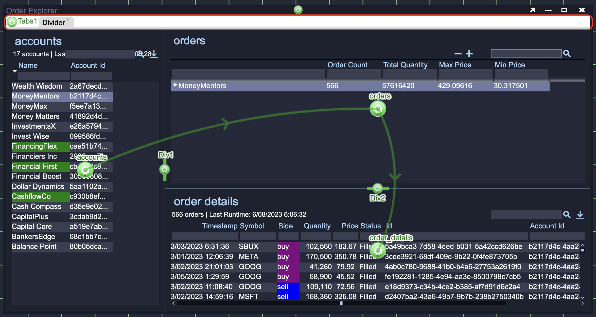
At the top of the Order Explorer window you will see that a new Tab Bar has appeared (see the New Tab Bar image above) with a single tab (called Divider) containing all of the content you previously created.
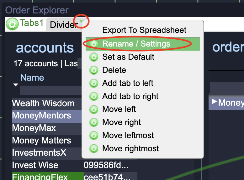
You should rename the Tab and give it a descriptive Tab Id so that it is easy to find later. Click on the small green Triangle to the right of the Tab name and choose Rename/Settings (see the Tab Settings Menu image below).
As the tab shows information on accounts and orders a reasonable Title is Accounts and Orders and a descriptive Tab Id is accounts_orders_tab. In the Tab Settings window that pops up, set these two fields.
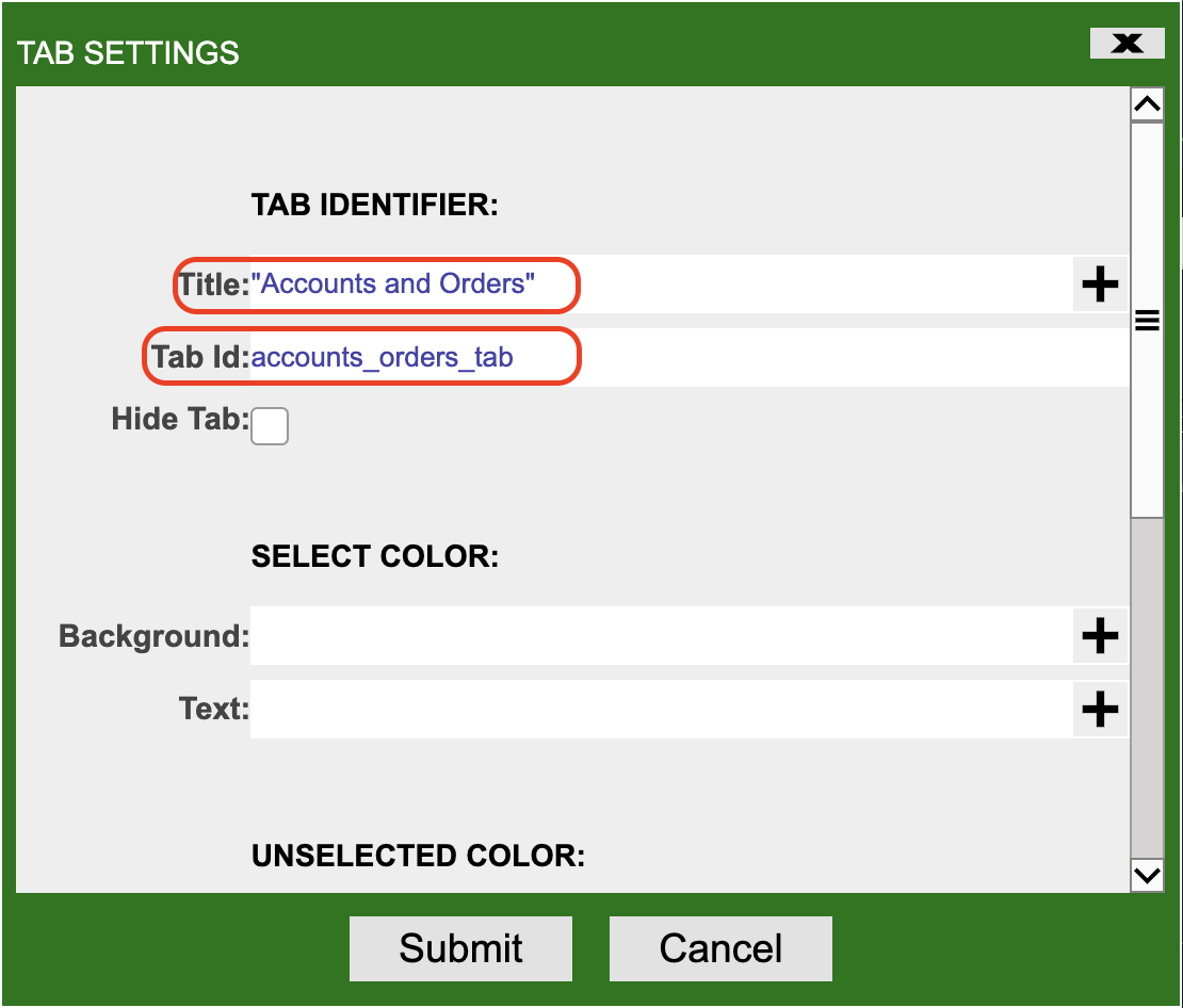
Click on the Submit button.
Create a New Tab
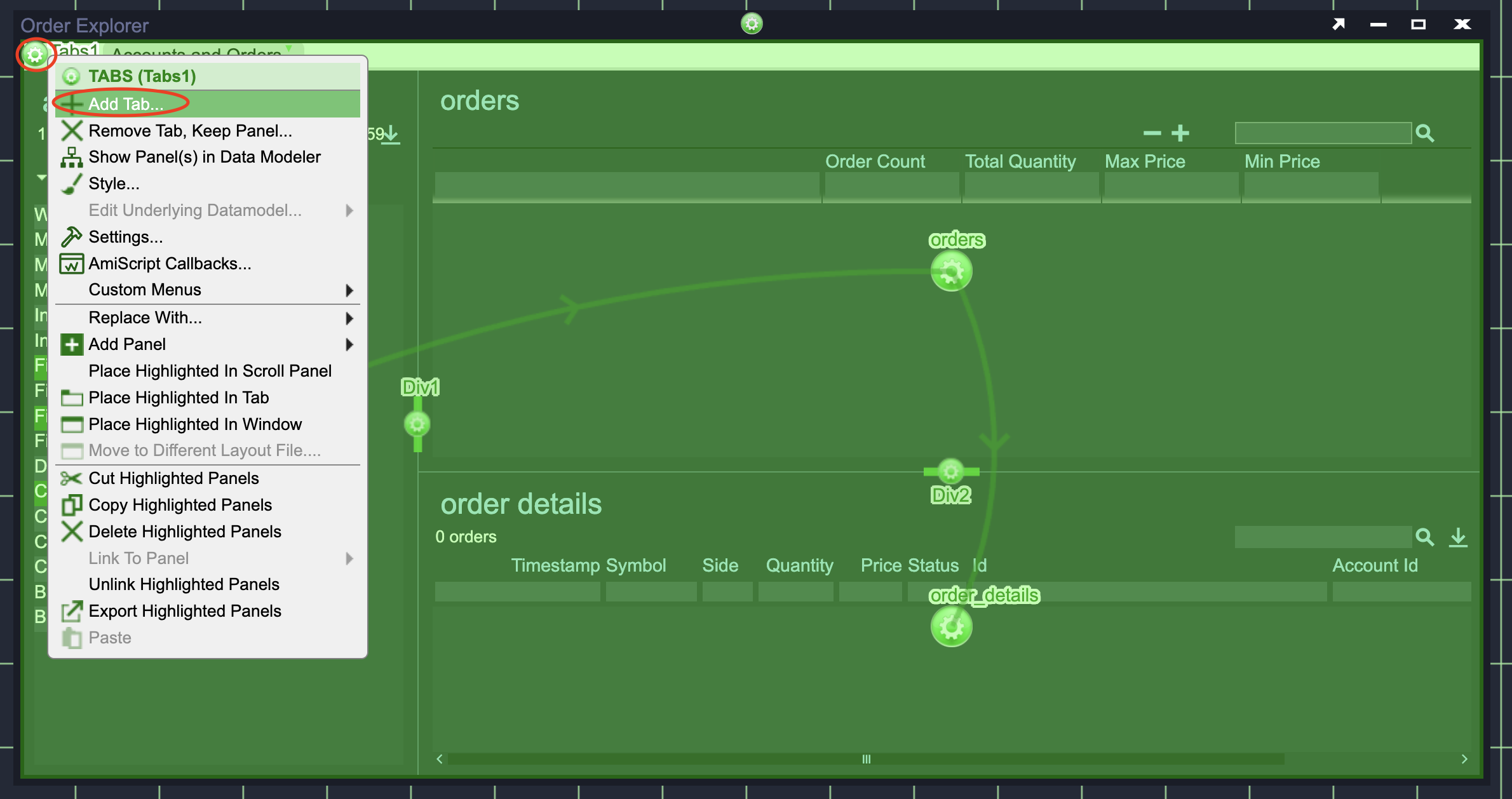
Now that you have moved your existing panels into a tab, you will create a new tab to contain related visualizations. Click on the green Gear in the upper left hand corner of the window to access the Tabs' menu and choose Add Tab.
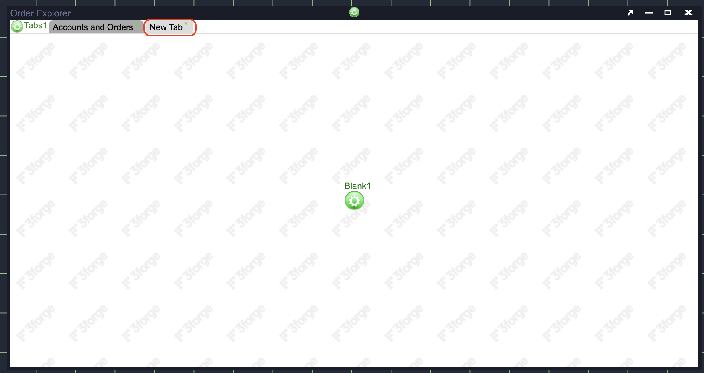
A new Tab called New Tab will be created and added to the right of Accounts and Orders tab that you already created and the content of the new tab will be Blank.
Info
Don't worry, all of your work is still there but is just contained in the Accounts and Orders tab. You can show the contents of a tab by clicking on its name.
Finally, you should give the new tab a good Title and Tab Id. Double click on the new tab's name. In the Tab Settings window that pops up, set the:
- Title to Orders Details Chart.
- Tab Id to order_chart_details_chart_tab.
Submit the changes.
Styling the Tabs Component
You may notice that the tabs and tab bar do not follow the same style as the rest of the application. While you could change the style just for these tabs, if you created more tabs you would need to style them again.
In AMI you can set the default style for a User Interface (UI) component. This way, you will not have to set style for each instance of the component.
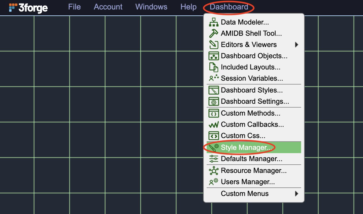
Click on the Dashboard menu and select Style Manager (see the Style Manager Menu image below).
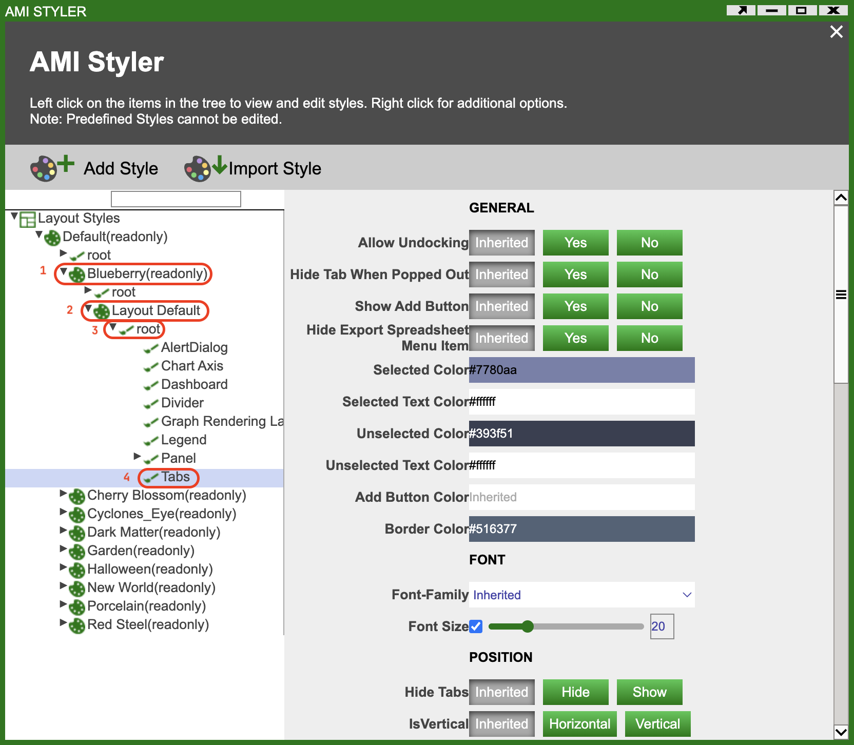
In the AMI Styler window that pops up, expand the tree on the left by clicking on (see Style Manager image above):
- Blueberry(readonly)
- Layout Default
- root
- Tabs
On the right hand side of the window you will see a long list of fields that you can configure to alter the presentation of tabs and the tab bar.
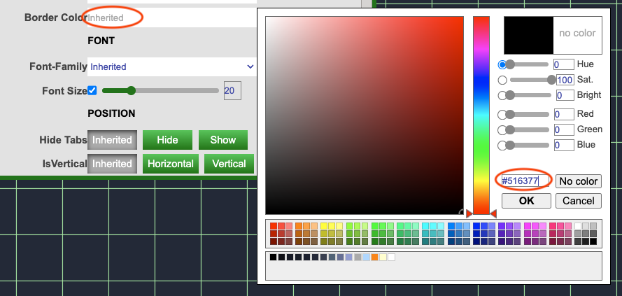
Update the fields shown in the table below to the associated values in the table. This will give the tabs an appearance that matches the rest of the application. To set the color values, click on the field value (eg inherited) and in the pop-up color picking window the color can be pasted into the input box above the OK button (see the Setting Color Fields image below).
| Section | Field | Value |
|---|---|---|
| General | Selected Color | #7780aa |
| General | Selected Text Color | #ffffff |
| General | Unselected Color | #393f51 |
| General | Unselected Text Color | #ffffff |
| General | Border Color | #516377 |
| Font | Font Size | 20 |
| Visualization Padding | Color | #242938 |
| Spacing | Tab Height | 24 |
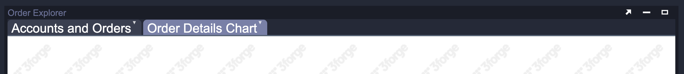
When you have made all of these changes the tabs and tab bar should look like the image below:
Create a Line Chart Visualization
Now that you have multiple tabs available for visualizations, you will add a Line Chart to the currently empty tab. Before adding the Line Chart you should consider what data will be used for the chart? You are trying to visualise the orders displayed in the bottom right Table Visualization. This visualization uses the order_details datamodel. The Line Chart visualization will not need any additional data. Therefore, you can use the order_details datamodel for both the existing Table Visualization and the Line Chart Visualization.
- Click on the green Gear in the center of the tab and select Create Table / Visualization / Form.
- When the Data Modeler window pops up, select the order_details
datamodel.
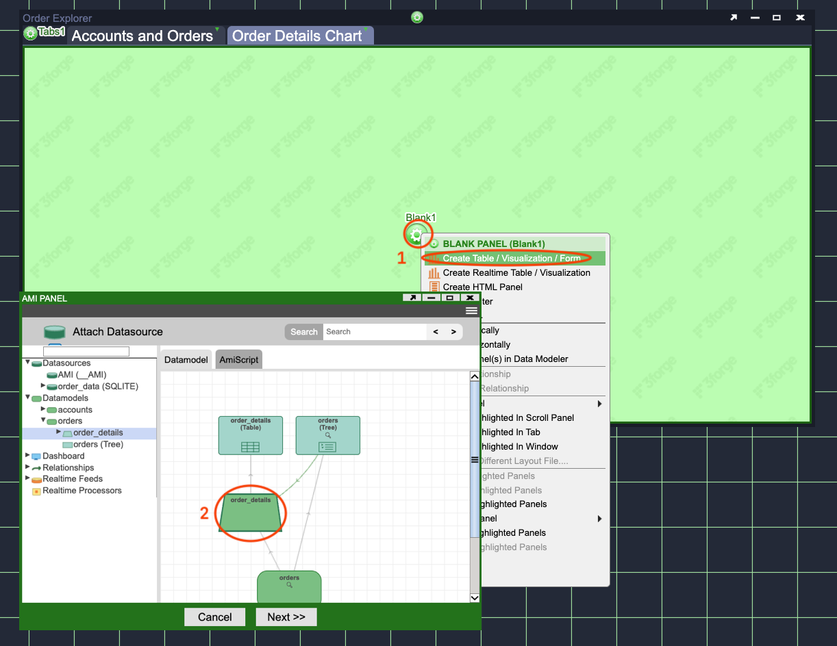
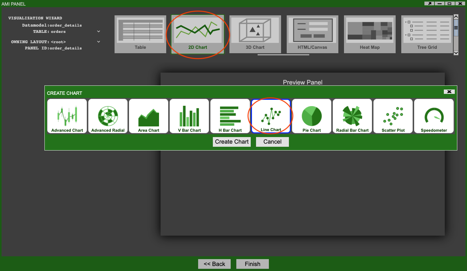
Confirm that you want to create the visualization on this datamodel and in the Visualization Wizard window select 2D Chart and then Line Chart (see the Select Line Chart image above).
Configuring the Line Chart
The Visualization Wizard will open and you will see a preview of the Line Chart you are adding, it will probably not show any data initially. You will setup some initial configuration so that some data is visible and you have a good starting point to make further changes later.
Before Configuring the Chart
Before you make any changes, move the Visualization Wizard window so that you can see your tabs and existing visualizations.
- Select the Accounts and Orders tab.
- From the accounts visualization then select any single account.
- From the orders visualization expand the chosen account and select any single symbol.
See the Chart Configuration image below. Making these selections will result in the order_details datamodel containing a small set of data that is good for testing the Line Chart configurations you make.
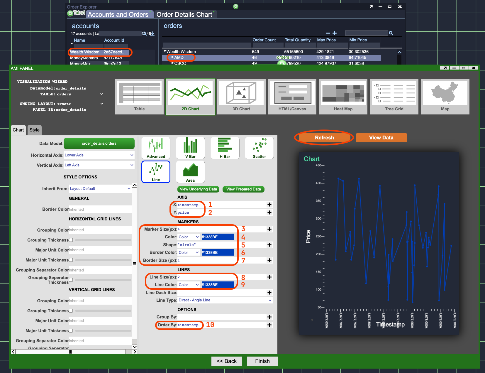
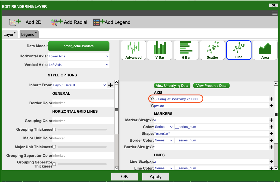
- X - Set this to
timestamp. This will cause each order's horizontal position to be set by its timestamp. The oldest orders on the left and newest on the right. - Y - Set this to
price. This will result in each order's vertical position being set by it's price. Smallest orders lower down and larger orders at the top of the chart. - Marker Size(px) - Set this to
4. This is the size of each point on the chart. - Color - Set this to
Colorand#1338BE. This is the color of each point on the chart. - Shape - Set this to
"circle"(include the quotation marks). This is the shape of each point on the chart. - Border Color - Set this to
Colorand#1338BE. This is the color of the border around each point on the chart. - Border Size(px) - Set this to
1. This is the size of the border around each point on the chart. - Line Size(px) - Set this to
2. This is the width of the line between each point on the chart. - Line Color - Set this to
Colorand1338BE. This is the color of the line between each point on the chart. - Order By - Set this to
timestamp. This is the order in which lines will be drawn between each point on the chart. Without it each point (order) will be in the correct location but the lines between each point will be seemingly random.
Click on the orange Refresh button so that the chart takes the new configuration. Your chart should look similar to the one shown in the Chart Configuration image above (the location of the points/lines may differ).
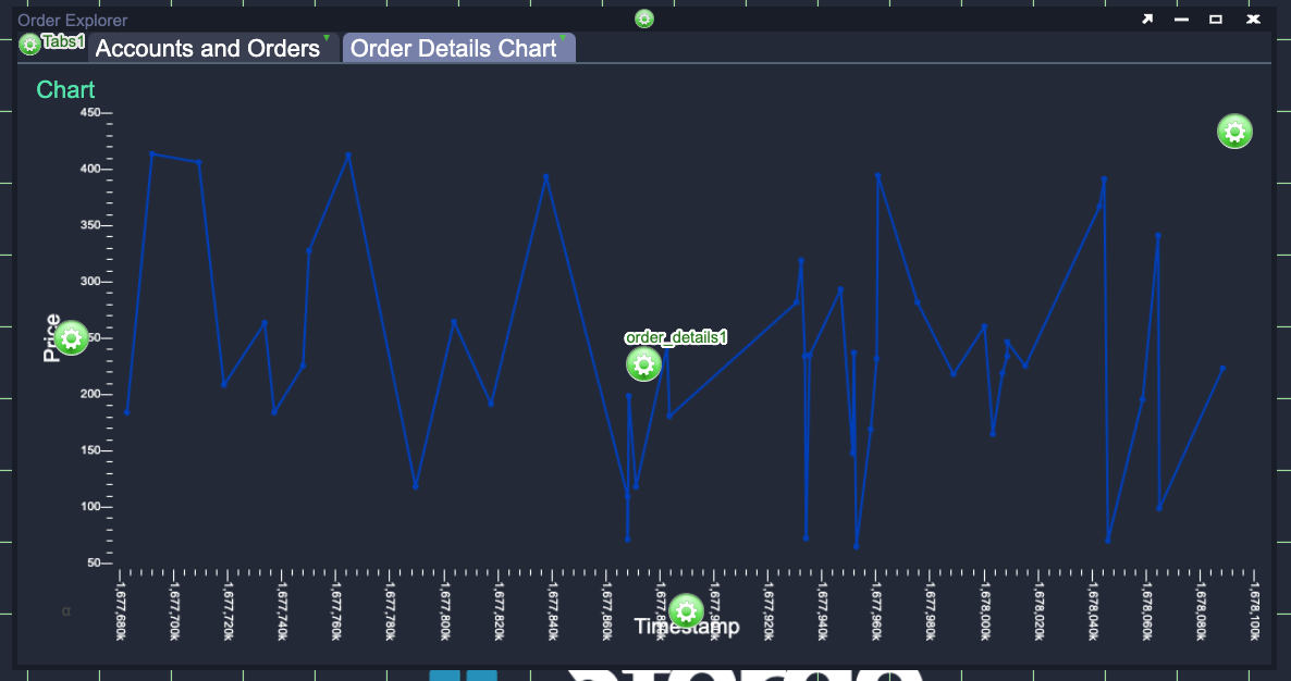
Click Finish, you should now have a Line Chart Visualization in the Order Details Chart tab. Try moving between the two tabs, making different selections in the Tree Grid Visualization and looking at how the chart changes as a result. Currently all orders included in the selection are plotted as one series (one line) in the same color. While this is a reasonable visualization, it would be better to separate different selections by plotting them as different lines and colors.
Relationships?
You may wonder why you didn't need to use a relationship to make the Line Chart Visualization update based on selections in the orders Tree Grid Visualization.
- Recall that you already created a
relationshipbetween the orders Tree Grid and order details Table Visualizations. - Making a selection in the Tree Grid causes this
relationshipto update the order_detailsdatamodelthat provides data for the orders Table Visualization. - The same order_details
datamodelprovides data for the Line Chart Visualization you just created.
Grouping the Data
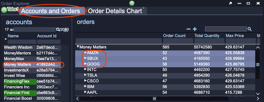
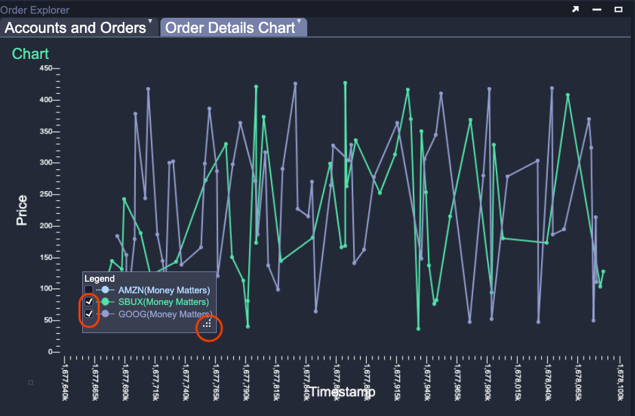
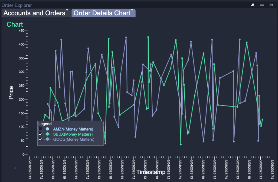
Currently, if you select multiple symbols in the Tree Grid Visualization all of the order data is plotted as one series. You will now make a number of small changes to group the Line Chart data, change the color of the lines and add a key (or legend).
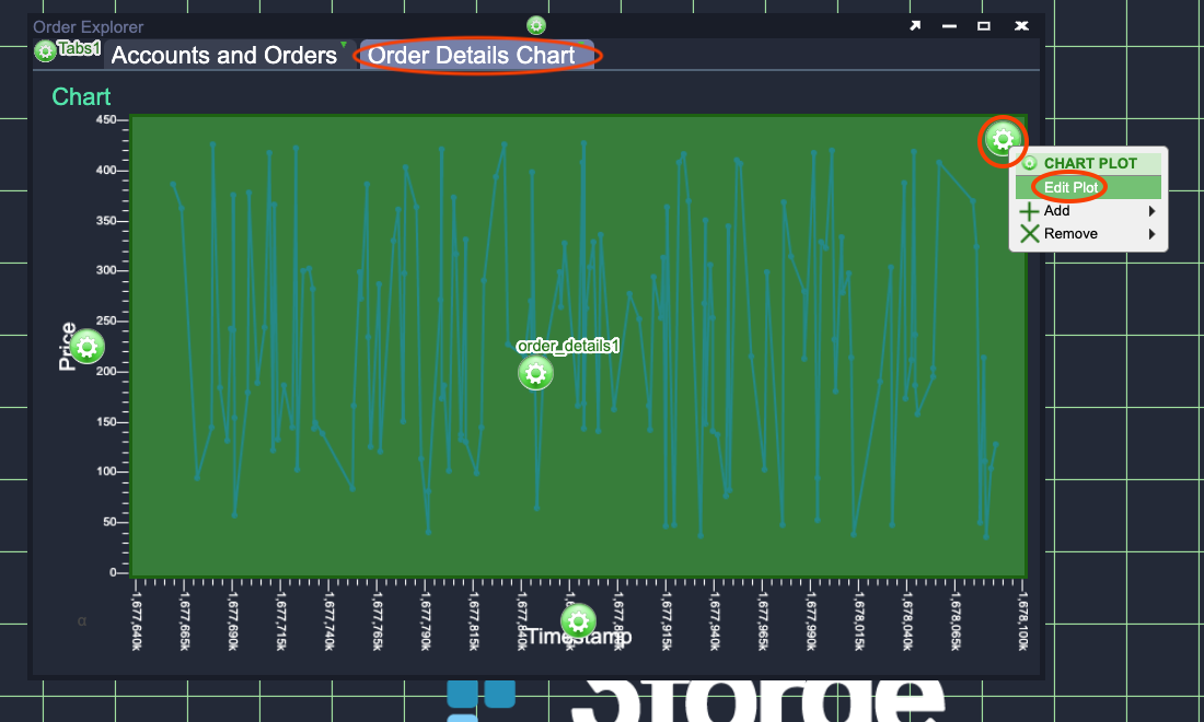
In the Accounts and Orders tab select one account then select two or three symbols from the Tree Grid Visualization. Go back to the Order Details Chart tab and click on the green Gear in the top right of the Line Chart. On the pop-up menu select Edit Plot. See the Edit Plot images below.
Selecting symbols:
Edit Plot:
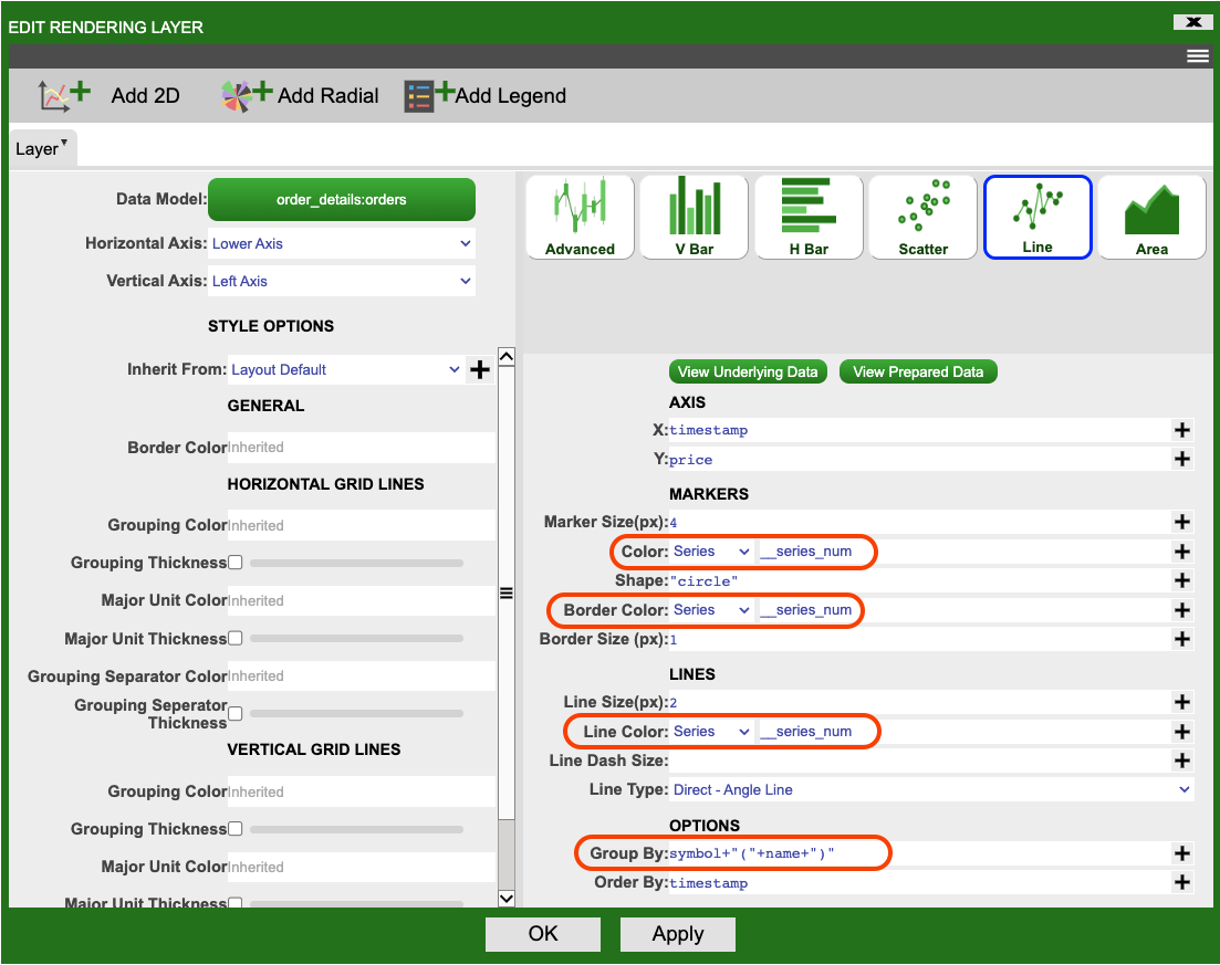
In the Edit Rendering Layer window that pops-up update the Color, Border Color and Line Color fields to fields and __series_num (there are two underscores before 'series'). This will automatically choose different colors for different series (groupings of data). The Grouping Settings image above shows the changes you need to make. Currently there are no groups of data, so update the Group By field to the following AMI Script.
datamodel contained 100 different orders for the symbols AMZN, SBUX and GOOG from the account Money Matters the data would be grouped into 3 groups:
- AMZN(Money Matters)
- SBUX(Money Matters)
- GOOG(Money Matters)
Legend
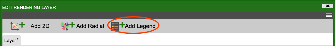
The configuration you have already made up to this point is enough to group the data. Adding a legend (key) is an optional step, but it is very useful to have when interpreting a chart containing many series. Click on the Add Legend button towards the top of the Edit Rendering Layers window:
Click Apply to see the default legend applied to the Line Chart. You could leave it as it is or change its style so that it better matches the rest of the Line Chart. The colors chosen are shown in the
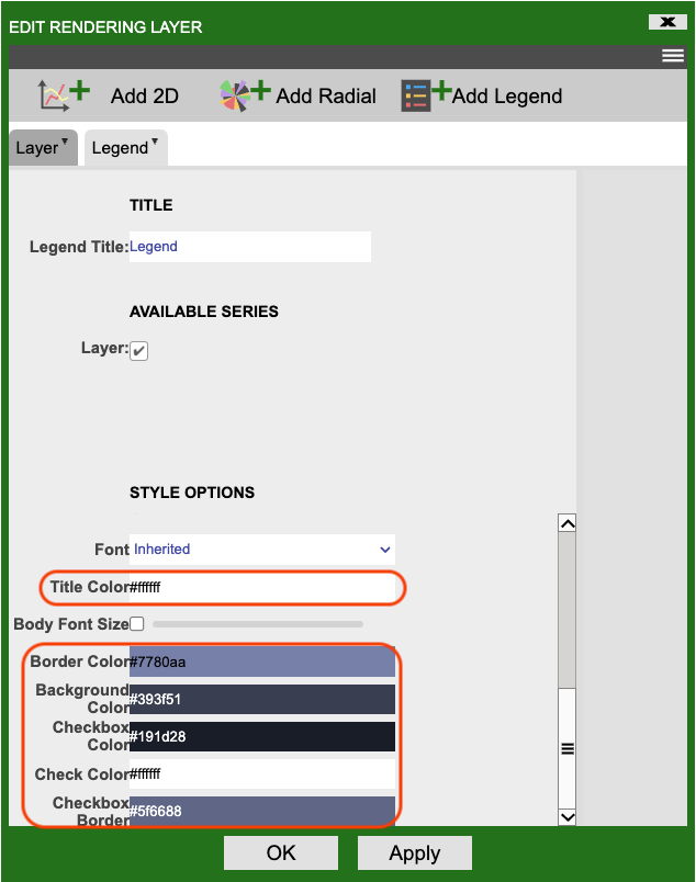
Once you have finished styling the Legend, click OK.
The legend may not initially fit all of the series however you can move and resize it at any time (in EDITOR or USER mode). Try the following: 1. Move the legend to the lower left corner of the chart by clicking on the legend and dragging it. 2. Make the legend larger by clicking on the lower right of the legend (small dots will appear in the corner) and dragging to the desired size. 3. Select one or two series in the legend using the checkboxes to the left of the series name.
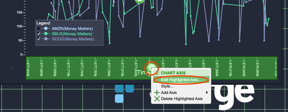
Axes
The final change you will make to the Line Chart is to update the x axis. This currently shows the raw timestamp rather than a human readable Date and Time. Open the plot settings by clicking on the green Gear in the top right of the Line Chart. On the pop-up menu select Edit Plot (see the Edit Chart Settings image below). Update the X field to contain:
This converts the raw timestamp value into the correct format for AMI's built-in Date and Time functions. Click OK.
Edit Axis:
Axis Settings:
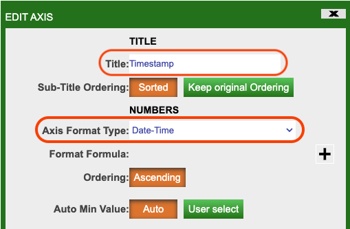
Now that the timestamp is in the correct format, you just need to tell AMI that it should treat it as a Date and Time. Click on the green Gear in the middle of the X axis and select Edit Highlighted Areas.... In the Edit Axis window that pops-up ensure that the Title field is timestamp and the Axis Format Type is Date-Time (see the Configure X Axis image above).
Click OK.
The completed chart should look similar to the image below:
There almost limitless opportunities for further customisation and styling of the various parts of the Line Chart Visualization.
Context Menu
The final feature you will add in this tutorial is a Context Menu item in the Tree Grid Visualization. This is a simple quality of life improvement that will allow a user to right click on a selected groups and view the associated chart. You will revisit context menus in later tutorials for more complex features but for now you will use one to make the Order Details Chart tab visible.
Make sure you are in EDITOR mode, go to the Accounts and Orders tab and click on the green Gear in the center of the orders Tree Grid Visualization.
- Click on Custom Menus.
- Click on Add Menu Item.
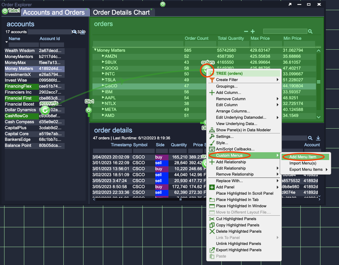
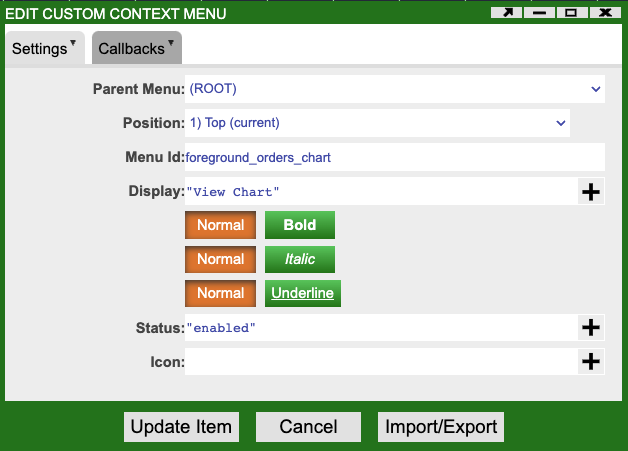
The Edit Custom Context Menu window will pop-up. Change the Menu Id field to foreground_orders_chart and the Display field to "View Chart" (include the quotation marks). This ensures that the menu item has a reasonable name to identify it and sets the visible text (what a user will see when they right click) to 'View Chart' (see the Menu Item Settings image below).
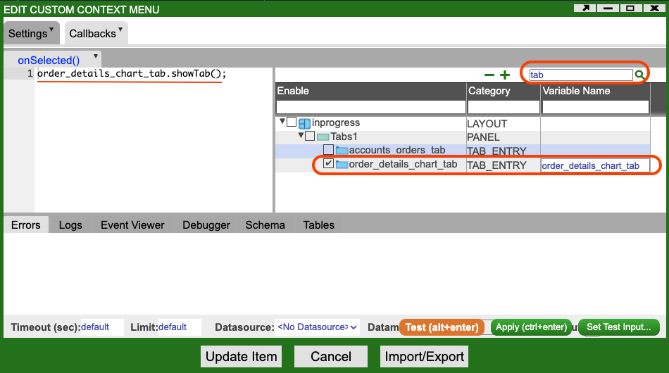
You now need to add a small amount of AMI Script to bring to show the Order Details Chart tab. Click on the Callbacks tab at the top of the Edit Custom Context Menu window.
The Menu Item Callback image above shows the result of the following steps:
- In the right hand section of the callbacks use enter
tabinto the search box at the top and press Enter.- Among the results will be two
TAB_ENTRYs. - One of these will be called
order_details_chart_tab.
- Among the results will be two
- Click on
order_details_chart_tabso that the checkbox to the left of its name is checked. This makes the tab accessible to the code you write in this callback. - Put the following AMI Script into the onSelected callback text area on the left:
Callbacks
Callbacks are pieces of code that will be called automatically (in this case by AMI) in response to some event. For the menu item, AMI will take care of showing the menu and any relevant menu items and detecting when a user clicks on (selects) this menu item. When the click is detected AMI will run the AMI Script you have written in the onSelected callback.
This AMI Script will call the showTab method (function) on the Order Details Chart tab, effectively telling AMI to make it the visible tab. You should now be able to test the context menu by selecting one or more items in the orders Tree Grid Visualization, right clicking and choosing View Chart. The Order Details Chart will be made visible and show you the chart for the orders you have selected.